Creating a Text Rolling Hover Effect with CSS and GSAP
Hover effects for menu items can add a touch of interactivity and visual appeal to your website. In this blog post, we’ll explore one such effect that involves a text rolling animation on hover. I stumbled upon this while assisting someone in the GreenSock forum, and I decided to share it with you. Below, you’ll find the step-by-step guide to implementing this effect in your projects.
Preview the Effect
Before we dive into the implementation details, take a look at the final effect in action.
See the Pen Menu rolling hover effect-CSS by trapti (@tripti1410) on CodePen.
This blog post discusses creating a text rolling hover effect using CSS and GSAP. The effect involves pushing the initial state and active state text up on mouse hover and bringing them back down on mouseout. The post provides HTML and CSS code examples, as well as a GSAP animation code example. It also addresses accessibility concerns by using the aria-hidden="true" attribute.
This is a simple animation that can be created in CSS as well. This kind of simple animations enhance the user experience of a website. This technique can be used to create many effects.
If you wish to see this effect on a live website, please visit the website and hover over the footer menu.
Let’s dive into creating this effect.
HTML Structure
<ul>
	<li>
		<a href="#">
			<span class="menu-item">Item 1</span>
			<span aria-hidden="true" class="menu-item-active">Item 1</span>
		</a>
	</li>
	<li>
		<a href="#">
			<span class="menu-item">Item 2</span>
			<span aria-hidden="true" class="menu-item-active">Item 2</span>
		</a>
	</li>
	<li>
		<a href="#">
			<span class="menu-item">Item 3</span>
			<span aria-hidden="true" class="menu-item-active">Item 3</span>
		</a>
	</li>
</ul>
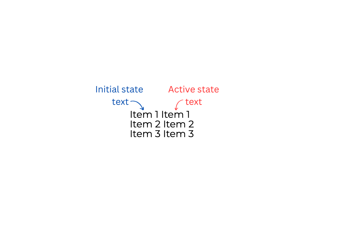
In this code snippet, each menu item consists of two spans representing the initial state (.menu-item) and the active state (.menu-item-active). The aria-hidden="true" attribute is used for accessibility. A detailed explanation of why this is required for accessibility is given at the end of this blog post. This is how it will look initially after adding the HTML

Styling with CSS
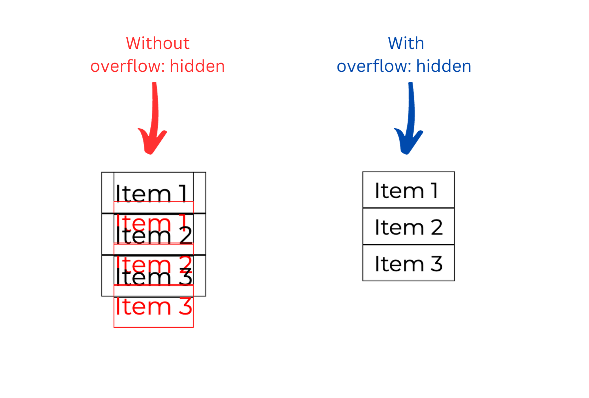
We will layout the texts in a way that the active state text should be below the initial state text and hidden initially. The li > a element, which is the parent of these texts, has a fixed height and overflow: hidden. The two texts will be in a row inside the li > a. I am using display: grid for lay outing these texts. I have also added a red color to the active state text for easy differentiation. Below is the code snippet for the same.
li a {
	display: grid;
	height: 20px;
	grid-template-rows: 22px;
	align-items: center;
	font-size: 2rem;
	line-height: 1.7;
	overflow: hidden;
	border: 1px solid;
	padding: 1rem;
}

.menu-item-active {
	color: red;
}
This is how it will look. In the above image I have shown the menu items representations with and without overflow: hidden to demonstrate the placement of the active state text inside the li > a.
Animation using GSAP
We will use the mouseover and mouseout event handlers for hover effects on each menu item. On mouseover, we will push the initial state and active state text up using transformY. On mouseout, we will bring both texts back down to their initial positions. Below is the code showcasing the same. Rest JavaScript and GSAP code is self-explanatory.
const menuItems = document.querySelectorAll('li');
menuItems.forEach((item) => {
    item.addEventListener('mouseover', () => {
        const hoverElement = item.querySelector(".menu-item-active");
        const el = item.querySelector(".menu-item");
        gsap.to(hoverElement, { **yPercent: -70**, duration: 0.3, ease: "sine.in" });
        gsap.to(el, { yPercent: -100, duration: 0.3, ease: "sine.out" });
    });
});
menuItems.forEach((item) => {
    item.addEventListener('mouseout', () => {
        const hoverElement = item.querySelector(".menu-item-active");
        const el = item.querySelector(".menu-item");
        gsap.to(hoverElement, { **yPercent: 100**, duration: 0.3, ease: "sine.out" });
        gsap.to(el, { yPercent: 0, duration: 0.3, ease: "sine.in" });
    });
});
The value of yPercent depends on where you want the text to be positioned in order to show and hide it correctly. When moving up, -70 was the correct value for the active text to be in the center of the li in this text layout.
Below is the CodePen showing the animation using the above code.
See the Pen Menu rolling hover effect-GSAP by trapti (@tripti1410) on CodePen.
Animation using CSS
We need to create two animations: one for when there is no hover and one for when there is hover on the menu items. For both of these, we need two animation keyframes: one for moving the initial state and one for moving the active state. On hover, we will move the initial state up in one @keyframes named move-up-initialmenu-onHover and bring the active state up in another @keyframes named move-up-activemenu-onHover. On no hover, we will move both of these back to their original positions in two separate @keyframes. Below is the animation code.
**/* Keyframes for hover animation */**
@keyframes move-up-initialmenu-onHover {
	100% {
		transform: translateY(-100%);
	}
}

@keyframes move-up-activemenu-onHover {
	100% {
		transform: translateY(-70%);
	}
}

**/* Keyframes for no-hover animation */**
@keyframes move-down-initialmenu-noHover {
	0% {
		transform: translateY(-100%);
	}
}

@keyframes move-down-activemenu-noHover {
	0% {
		transform: translateY(-70%);
	}
}

**/* Applying keyframes to the menu items */**
li a:link .menu-item {
	animation: 3s forwards move-down-initialmenu-noHover;
}

li a:link .menu-item-active {
	animation: 3s forwards move-down-activemenu-noHover;
}

li a:hover > .menu-item {
	animation: 3s forwards move-up-initialmenu-onHover;
}

li a:hover > .menu-item-active {
	animation: 3s forwards move-up-activemenu-onHover;
}
Let’s see these animations in action in the CodePen below.
See the Pen Menu rolling hover effect-CSS by trapti (@tripti1410) on CodePen.
♿️ Accessibility
In the HTML, we duplicate the content of menu items to achieve the desired effect. As highlighted earlier, this duplication involves both initial state and active state texts. However, this approach introduces a challenge for users relying on voice-over readers, as the content is read twice by the screen reader, leading to a less optimal user experience.
To avoid this, we will use the aria-hidden="true" attribute in the HTML elements, as shown below, for all the menu items.
<li>
	<a href="#">
		<span class="menu-item">Item 1</span>
		<span aria-hidden="true" class="menu-item-active">Item 1</span>
	</a>
</li>